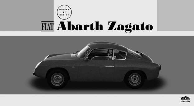
Based on the Fiat 600’s floorpan, the Fiat-Abarth 750 GT Zagato “double bubble” was Abarth’s aerodynamic, performance version of Fiat’s diminutive coupe. It made its debut at the 1958 Torino Motor Show and went on sale the following year as a continuation of Abarth’s 750 series. But this 750 was different as it was fitted with a 750cc Bialbero (DOHC) engine and featured an aluminum body styled by Zagato.
The car’s theme is reminiscent of other, earlier Abarths and Zagatos and foreshadows a few of their later models as well. In many ways, the styling is unremarkable except for its slippery shape. The only clear theme or identifying characteristic of the design is the double bubble roof and engine cover, which was necessitated by the bialbero’s extra height.

The design is clean however, and there is something to be said for restraint. Proportionally, it is strikingly similar to the Porsche 911. No surprise there, as the layout is identical. Examining the car in profile, one has to wonder how much input Austrian Karl Abarth had on the design. However, the Abarth 750 does appear to be a bit taller in height and shorter in length than the Porsche (probably due to the Fiat 600’s floorpan).
Surface-wise, the Abarth is similar to the Porsche again with the exception of the roof, engine cover, and rear fenders. The roof and engine cover are interesting (although the engine cover is a bit of a distraction), but the rear fenders don’t work on this car as they slow it down visually. Picture the way the 911’s rear comes to a point and then compare it to this slab-sided Fiat. The car doesn’t look slow, but it doesn’t really look fast either. One might argue that the added visual weight on the rear wheels emphasizes the Abarth’s rear-engine layout, which is true. But in this case it has the aforementioned negative consequence that outweighs (pardon the pun) the visual benefit. Additionally, the Abarth’s hood doesn’t dive as quickly or steeply as the 911’s, which makes the front look more blunt (which isn’t helped by the lack of a bumper).
Mercifully, the details are sparse. Except for the door handles and door mirror, most of the details are botched. Consider the Abarth’s front end, without a bumper to provide visual tension and break the front surface, the front sort of melts into the ground. Presumably, the bumper is absent to make the car lighter. But then what excuse is there for the c-pillar? The c-pillar is a cacophony of forms that struggle to relate. There are two vents on each side, the side window is rectilinear while the rear window has an organic, jelly-bean form, and finally, the top of the c-pillar seems pinched.
Even the Zagato badge could have been placed better: rather than mounting it on the front fender, which was their standard practice, a one-time exception would have been preferred. Had the badge been placed on the rear fender, at a similar height and relative placement, it would have emphasized the drivetrain and the power hidden within the rear.
Viewed from the rear, the design is much stronger, however the double bubble roof still makes the little Zagato appear top heavy. While the design is clean, calling it beautiful is a giant stretch. Still it has merits that must be considered. If you’re curious what those are, make sure you check back tomorrow...
By: Yoav Gilad
article courtesy of www.petrolicious.com